
Tuesday, July 22, 2008

Baseball Cards


I've collected baseball cards for about 20 years or so. Well, to be more accurate I've had a baseball card collection for about 20 years, I haven't actually purchased any in years but I like to keep the ones I do have.

My collection really started in earnest in 1989 after our family moved from Germany to Kingston Ontario. We had kept a lot of our stuff in storage while we lived in Germany so when we got back there were a lot of boxes full of our old stuff to look through.

In one of those boxes I found a dusty paper bag that was filled with probably about 150 or so baseball and hockey cards that had been my dad's when he was a kid in the early 50s.

Most kids from his generation cursed their mothers for throwing out childhood baseball card collections that would have been worth small fortunes when they grew up, but my Grandma didn't fall into that trap. Unfortunately however my discovery of this horde didn't make us wealthy either.

The fault, believe it or not, lay with the designers of a wallet my dad had when he was a kid. They chose to make the wallet approximately 3mm narrower than a baseball card. This forced my dad, who wanted to carry his favorite cards around in his wallet, to take out a pair of scissors and trim the margins off his cards.

This 1954 Topps Ted Williams card, for example, is something like a $700 card. However, it is supposed to have a white border around the orange background. You may notice that this is missing. Ditto with the 1953 Roy Campanella, which seems to have had the added indignity of being folded into quarters and stuffed into a pocket at some point.

For those of you who don't know much about baseball card collecting, a $700 baseball card which has had its margins cut off by a kid with a pair of scissors loses approximately $700 of its value.

.231 career hitter Bobby Morgan's card survived intact of course.

Anyway, I quite like these cards even without the margins and wouldn't sell them for a fortune even if I could.
Sunday, July 20, 2008

On Studying the Japanese written language


In preparation for my studies at Kyushu I've gotten back into studying Japanese, which (it turns out) I missed.

My hope is that I'll get myself up to a level where I can do some legal research using Japanese source material, though this would be over my head at this point (I know virtually no Japanese legal terminology).

Anyway, I've dragged out my Japanese books and am reading again. During my stay in Japan I built up a pretty good library of Japanese books, mostly novels. They have a chain of used book stores called "Book Off"which I used to frequent, looking to build up my collection on the cheap (most of my books come from the 100 yen section). Of the couple hundred books in my collection I have read a grand total of 2 of them cover to cover (both by Haruki Murakami, whose books are written in modern colloquial language and thus quite easy for the student to read).

Ena and I also used to go to the Toji temple market in Kyoto, which is a great place to buy antiques. I picked up a quite a few old Japanese books there.

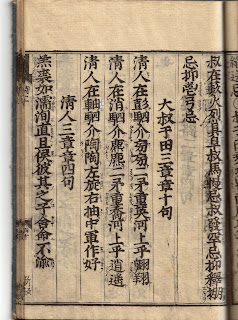
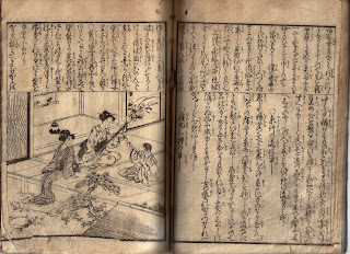
On looking over my collection, its interesting to note how the development of the Japanese language over the past century and a half or so has made older books almost completely incomprehensible. The above images, for example, are taken from books published in the mid-19th century.

The top one is a page from a book of Chinese poetry that is written in Chinese. You can tell it is a Japanese book because of the little interlinear characters. These allow a Japanese person to read it even though it is written entirely in classical Chinese. The Japanese know the meaning of the characters but the grammatical rules, etc. are different in Chinese. But with these little interlinear cues they can follow the meaning. I have a textbook somewhere that explains how to do this, but I've never been able to get a handle on it, mainly because my Japanese is nowhere near good enough to be learning a third language through it.

The second image is a page from a school textbook. Unlike the top one, which has sharp, well defined characters, this one is written in a calligraphic style that, while visually appealing, is virtually impossible for someone who has solely studied modern standardized Japanese to read. The characters flow into each other and a lot of the strokes used in the more complicated characters are abbreviated so it is difficult to decipher which character each one is.

Basically they look like a bunch of elegant but indecipherable squiggly lines to people with no familiarity at all with Japanese and that is basically what they look like to me too.

Saturday, July 19, 2008

Sean's first blog

In two months I am going off to Kyushu University for a year of study in Japan and I thought "hey, wouldn't it be cool to do a blog while I'm there" so I've set this up early. I'm such a keener.

Anyway at the moment I am working at an excellent law firm in Victoria, until the end of next month. But preparations for the trip are getting underway. Ena's got a plane ticket and I'm waiting to hear from the Ministry of Education (they'll be arranging my transport) so I can go get my visa.